Lake Forest Acute Care

-
Research
-
Graphic Design
-
UI/UX Design
-
Web Design

Web Design with a Modern Refresh
Lake Forest Acute Care, a healthcare center in Illinois needed a website redesign to establish their company on a professional enterprise level.
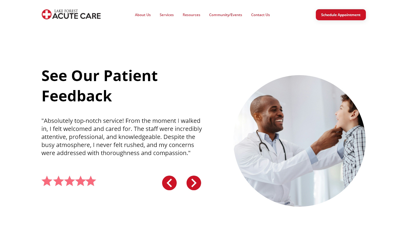
Their team engaged ArtVersion to take the lead on the redesign with a few objectives in mind including, showcasing their healthcare services to build customer engagement and improve their online presence to allow users to make appointments seamlessly. ArtVersion designed the website with a professional and modern look and feel with a design language centered around circular motifs. The circular route was intentional as it played off the healthcare center’s logo but rounded shapes were also used to evoke trust, tranquility, and approachability.
On the development and backend functionality of the website, ArtVersion integrated custom and interactive coding to enhance web usability and performance. The integration of APIs also allowed for a robust and simple way of scheduling appointments, and integration of custom forms and resources throughout. The website was further enhanced with SEO best practices within the website’s infrastructure and coding with the inclusion of meta-data integration for higher web rankings, engagement, and visibility.


Appointment Scheduling Process

Color Palette
The primary color palette of the website was curated to reflect the colors of the healthcare center’s logo. There was also a symbolic backstory to the color selections. Red is often associated with energy, strength, and vitality, which in the context of the website, reflected a commitment to life-saving services, emergency care, and the vital nature of health. Red was also used as a powerful color that commanded attention, symbolizing the urgency and importance of healthcare. White, on the other hand, is universally recognized for its association with cleanliness, safety, and purity—essential qualities for any healthcare provider while offering visual dimension and depth.


Typography
The simplicity and clarity of Open Sans promoted a sense of trust and professionalism, aligning with the values expected in healthcare. Its wide range of weights and styles allowed for a flexible hierarchy, making it easier to distinguish between different types of content, such as headings, body text, and call-to-action buttons. This versatility enhanced the user experience by guiding visitors effortlessly through the site's content. Moreover, the modern yet unassuming appearance of Open Sans evoked an approachable and informative.

Custom Iconography
To heighten the website’s visuals, the graphic design team at ArtVersion designed custom iconography to add visual cues for microinteractions. All icons took on a thin, linear design approach for a contemporary, yet professional aesthetic. Beyond their aesthetic appeal, the icons were carefully chosen to embody universally recognized medical symbols, leveraging visual communication to foster user interaction. This thoughtful design element guided users seamlessly through the website with intuitive navigation.


The Outcome
The website became a standout platform for the Lake Forest community, significantly boosting engagement and interaction among its guests.
Its design and functionality were tailored to meet the specific needs and expectations of its users, making it more than just a healthcare website. The authentic design contributed to the website’s overall narrative and visual storytelling, enhancing the sense of comfort and trust that individuals seek when looking for medical assistance. The website and its assets conveyed a welcoming and reliable atmosphere, meeting the needs of future guests.


