Affinity Practice
UI/UX Experience for Psychiatry Sector
Affinity Practice, an outpatient psychiatry clinic specializing in therapy and emotional wellness in Illinois, needed a website that reflected its mission.
To achieve this, they engaged ArtVersion to solidify their visual design language and overarching brand story. To encapsulate the design language that the new Affinity Practice website would undertake, ArtVersion applied design thinking methodologies throughout the conceptual and contextual process. This process began by conducting user research on Affinity Practice’s demographic. The clinic’s services were catered to a varied audience—children, adolescents, and adults, therefore ArtVersion crafted a design system that could resonate with everyone.
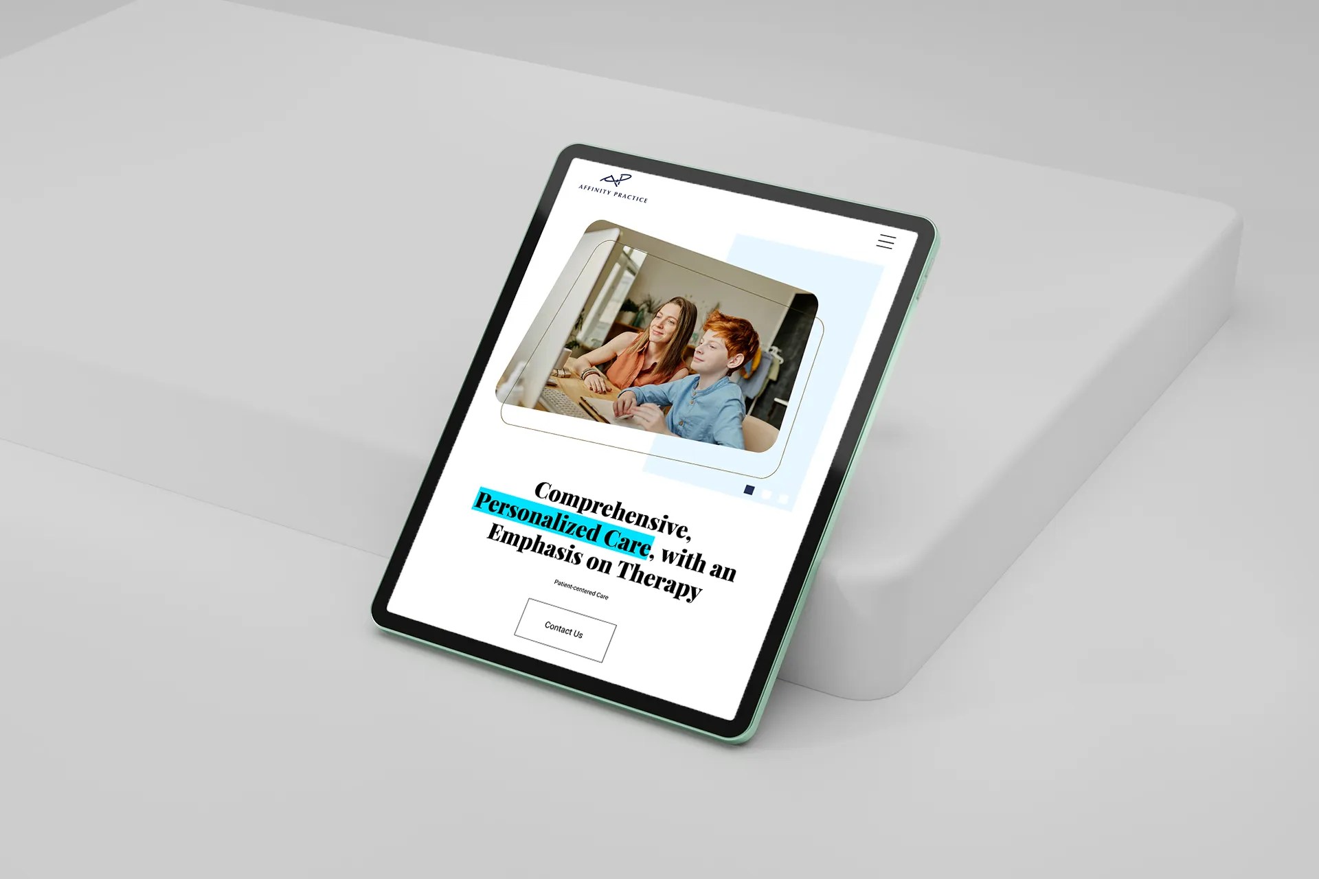
The tonality took shape with an approachable, contemporary look and feel, while still considering a professional aesthetic. Geographic elements were custom-designed throughout the website with soft edges, to evoke a welcoming feel, while introducing a contemporary visual story that felt unique to Affinity Practice. The graphic components further drove in the welcoming and approachable feel that their stakeholders wanted, and helped steer clear of a static site.


User-Centric Methodologies
The website was a platform for Affinity Practice to garner more traffic and grow its audience to help more individuals in the community in need of mental health.
Therefore, ArtVersion deployed a user-centric perspective for the usability and structural framework of the website. This included strategizing seamless pathways and navigation for easy interactions that allowed users to find their services right away. A contact form was also embedded into the website to allow users to easily get in touch and schedule appointments with the clinic. The ease was further structured by a robust information hierarchy that showcased their services and mission on the home page. Additionally, performance and optimization were further strengthened with a CMS framework that prioritized ease of maintenance and security. In tandem, ArtVersion’s development team also prioritized SEO and meta-data implementation to increase the website’s visibility.


Color Selections
Evoking the welcoming and calming aesthetic that the Affinity Practice team was seeking was achieved with a soft blue and light teal color palette. Light blue evoked serenity and stability, symbolizing an environment where patients feel secure and supported. Light teal combines the refreshing qualities of green and the calming aspect of blue, enhancing feelings of emotional healing and balance. Together, these colors contribute to a therapeutic ambiance that was conducive to professional care and emotional wellness.
Typography
The nuanced duality of Playfair and Roboto typefaces were selected as they both balanced approachability and professionalism. Playfair, with its serif design, added a touch of elegance fortifying the clinic's credibility and expertise. Roboto, a clean and modern sans-serif, brought out a more relaxed and accessible feel with readability and a friendly approach. The combination of Playfair's formal authority with Roboto's straightforward simplicity contributed to a unified visual story.


The Outcome
Future-Forward Web Experience
The result of the website offered Affinity Practice a digital presence that helped create increased visibility for their services. The clinic was now equipped with a platform that could help them drive their mission forward of creating a safe, reliable place for mental wellbeing today and into the future.
