ED&F Man

-
UI / UX Design
-
WordPress Development
-
SMM Campaign

Custom UI Dashboard Design for Financial Leaders
ED&F Man, a leading company in investment services, partnered with ArtVersion to revamp their software user interface (UI).
The initiative aimed to create a UI for the software Fortress, that emphasizes visual and data hierarchy, ensuring that essential information is prominent and easily accessible. ArtVersion designed dashboard screens that showcase ED&F Man’s services in commodities trading, OTC pricing, and integrated market data effectively. The focus was on developing an intuitive and user-friendly interface that felt familiar to those accustomed to navigating financial platforms yet distinctively tailored to ED&F Man’s design aesthetics.
The new UI features a variety of data visualization tools, including dynamic charts and interactive infographics, which present complex data in an engaging and easily understandable manner. This enhanced the user experience by enabling quicker and more informed decision-making. ArtVersion also introduced advanced filtering options and customizable widgets, allowing users to personalize their dashboard view to suit their specific needs and preferences. These enhancements improved functionality and aligned with ED&F Man’s brand identity, reinforcing their position as a forward-thinking leader in the investment services sector.

Desktop UI

Mobile UI

Dark Mode

Desktop Elements


Mobile

Color Palette
The color palette for the software was thoughtfully selected to align with ED&F Man’s established brand legacy, incorporating their signature colors into the dashboard and UI. ArtVersion prioritized readability and ease of use, strategically choosing colors that would enhance the user experience without overwhelming it. This careful balance was achieved with green and grey hues, formatted with accessibility in mind. The colors also ensured that the interface was user-friendly and conveyed a sense of innovation and modernity.


Typography
Open Sans was the ideal typeface for dashboard readability due to its clean and neutral design, which enhanced clarity and legibility across different screen sizes and resolutions. Its open forms and generous letter spacing prevented crowding, which made it easy on the eyes for prolonged viewing, which is crucial for users who navigate complex data on dashboards.

Company-Focused Marketing
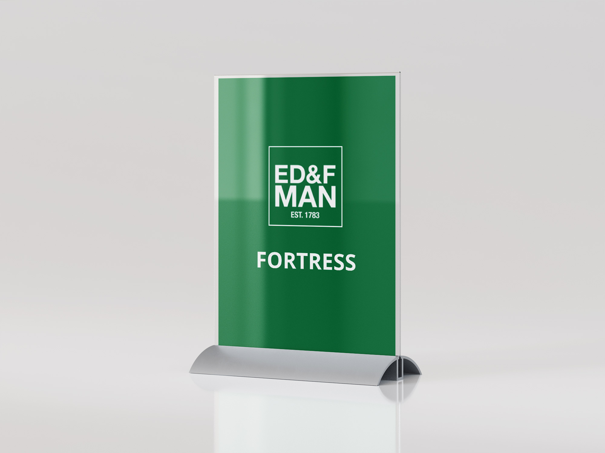
To enhance awareness of the new UI, ArtVersion crafted a suite of marketing materials that spotlighted ED&F Man’s leadership and strategic positioning in the market.
These materials were tailored for use at events and conferences, providing a visual and informational representation of the advanced features and benefits of the redesigned interface. The optimized designs also played a crucial role in increasing engagement with potential clients and partners during industry events. The focused promotion helped to convey the value of ED&F Man’s offerings, reinforcing their standing as a forward-thinking leader in investment services.


The Outcome
The collaboration between ED&F Man and ArtVersion resulted in a highly successful redesign of the company's user interface, aligning it seamlessly with its brand identity.
The introduction of a clear and intuitive dashboard, combined with the strategic use of color and information hierarchy significantly improved the user experience. This made the platform easier to navigate and more visually appealing and accessible. Overall, the project exceeded the company’s objectives, setting a new standard in user interface design within the financial sector.


