


Every day at ArtVersion, my team and I delve into the intricate details that define our clients’ brands. People often ask how we consistently deliver exceptional results. The answer lies in our obsessive focus on every design element—from selecting the perfect colors and achieving optimal contrast for accessibility to choosing the right typeface and creating cohesive design languages. Whether we’re building a new product identity or refining an existing one, our iterative, user-centered approach ensures that every project is tailored to resonate with its audience and exceed expectations.
The Power of Detail
Our team understand that every element in design holds significance. Whether it’s selecting the right colors, achieving contrast, or ensuring accessibility compliance, we obsess over each detail. Colors are more than just visual appeal; they convey emotions and messages. We ensure that every hue and shade chosen aligns with the brand’s identity and speaks to its audience.
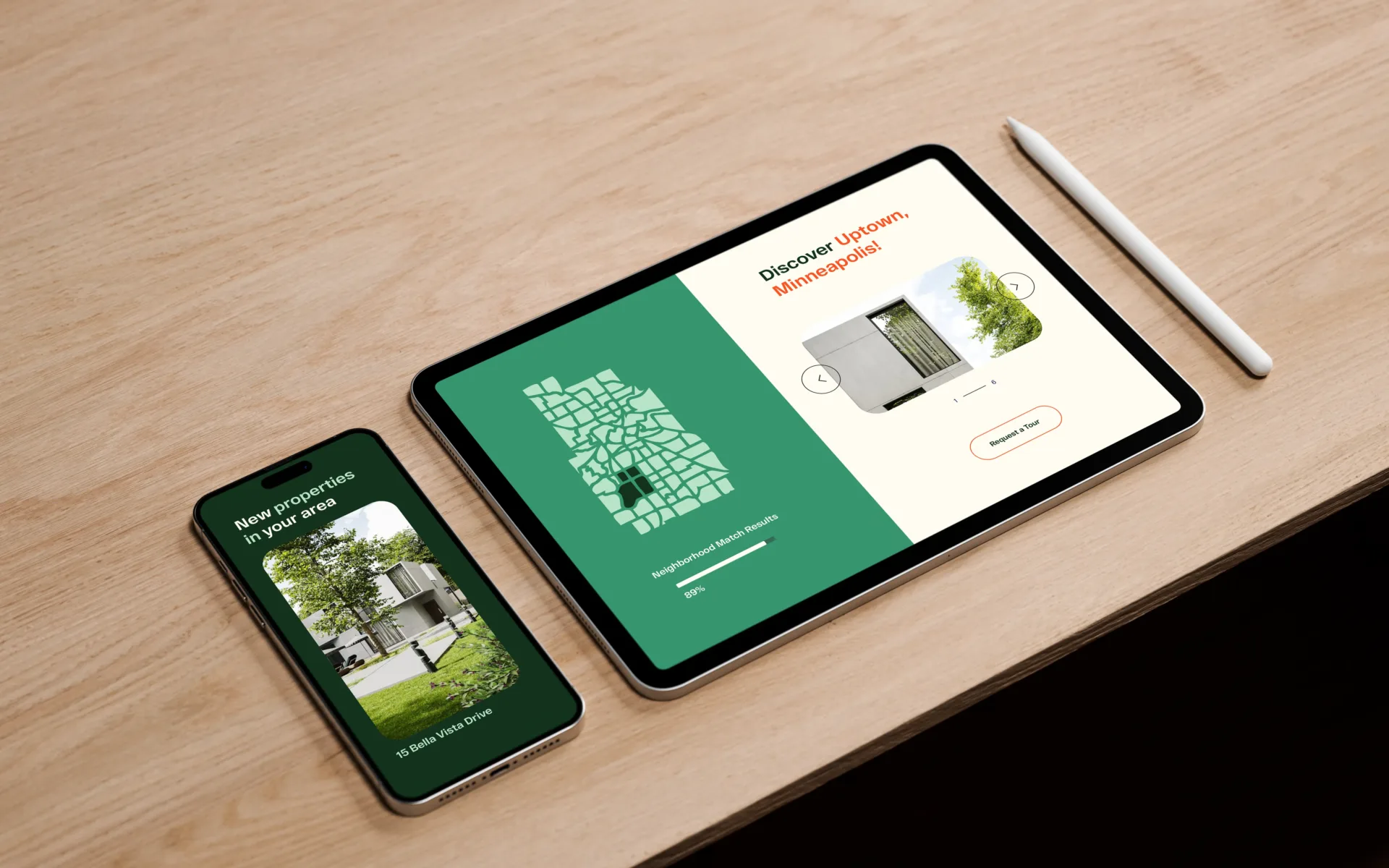
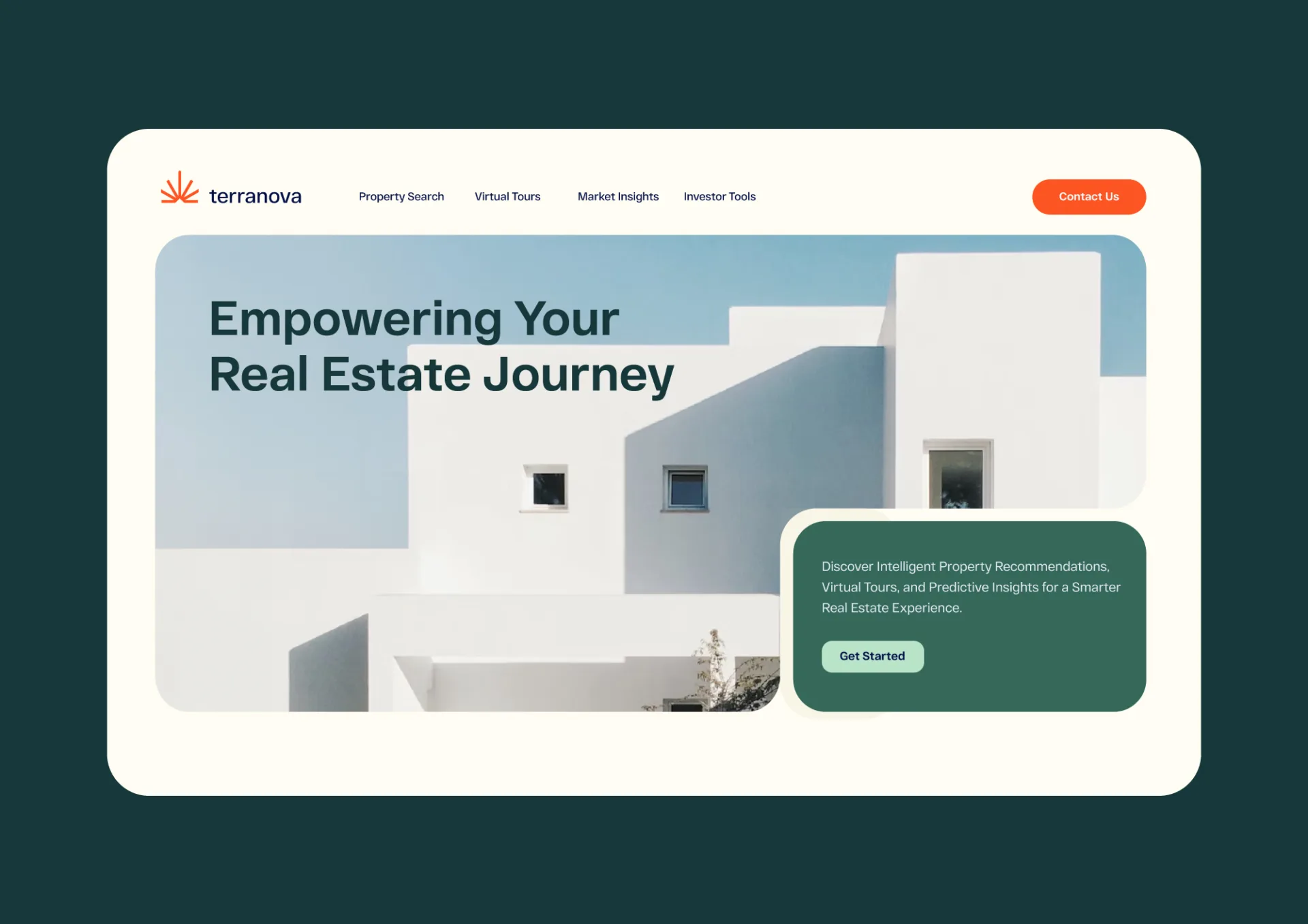
Color plays a pivotal role in both branding and user interface design. It is more than just a visual element; it is a powerful tool that communicates emotions, creates connections, and influences perceptions. At ArtVersion, we understand that the right color palette can make or break a brand’s identity.
When we select colors, we consider the psychological impact they have on the audience. Each color evokes specific feelings and associations. For instance, blue often conveys trust and professionalism, making it a popular choice for financial institutions, while green is associated with health and tranquility, suitable for wellness brands. We meticulously choose colors that align with the brand’s core values and message.
Achieving balance in color usage is crucial. Too many colors can overwhelm the user, while too few can make the design appear dull. We strive to create harmony by selecting a primary color that represents the brand and complementing it with secondary and tertiary colors that enhance the overall aesthetic without overpowering it. This balance is essential in ensuring that the brand is both visually appealing and memorable.
Contrast is another vital aspect of color in design, especially for the web. It not only enhances readability but also ensures accessibility for users with visual impairments.
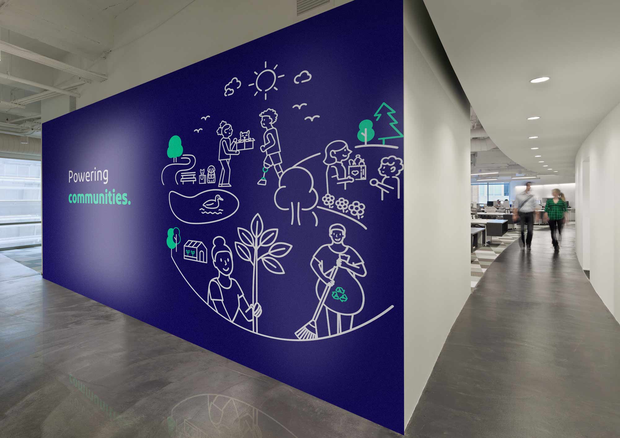
Furthermore, color consistency across all platforms—whether web, print, or motion—helps in reinforcing the brand identity. Creating detailed style guides that outline color specifications, ensuring that the brand’s color palette is used consistently across all media.
In user interface design, color guides the user’s journey through the application or website. It highlights important elements, indicates actions, and provides visual feedback. By using color strategically, we enhance the user experience, making interactions intuitive and engaging.

Typography and Shapes: More than Just Aesthetics
Typeface is another crucial aspect of our design philosophy. The choice of fonts can greatly influence how a brand is perceived. We meticulously select typefaces that reflect the brand’s voice, ensuring readability and consistency across all platforms. Shapes, patterns, and styles are equally important, as they help create a visual language that is unique to each brand.
Shapes, Patterns, and Styles
Shapes, patterns, and styles are foundational elements of visual communication and are among the most critical aspects of graphic design. These elements transcend mere decoration; they serve as powerful tools that convey meaning, evoke emotions, and establish a visual language unique to each brand.
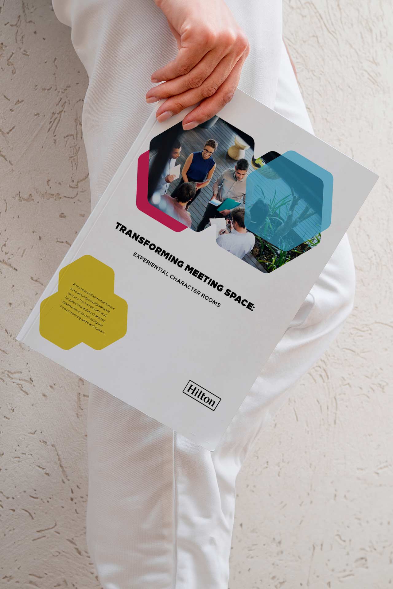
Shapes are the building blocks of design. They can symbolize various concepts and emotions—circles often represent unity and harmony, while squares and rectangles convey stability and reliability. By strategically incorporating shapes into a brand’s visual identity, we can subtly communicate its core values and message. For instance, using rounded shapes might suggest approachability and friendliness, while angular shapes can imply professionalism and precision.
Patterns add depth and texture to designs, creating visual interest and reinforcing brand themes. They can be used to create a sense of movement, guide the viewer’s eye, or provide a backdrop that enhances the main elements of the design. Patterns help in building a cohesive visual system that is instantly recognizable and memorable. They can also evoke cultural or historical contexts, adding layers of meaning to the brand’s story.
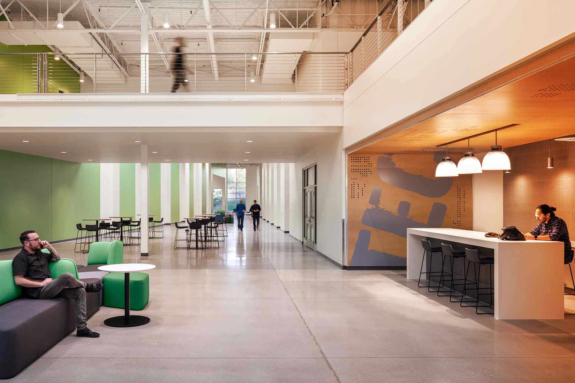
Styles, encompassing the overall look and feel of the design, are essential in setting the tone and personality of a brand. Whether it’s a minimalist approach that emphasizes simplicity and clarity, or a more ornate style that conveys luxury and sophistication, the chosen style must align with the brand’s identity and resonate with its target audience. Consistency in style across all brand materials ensures a unified and professional appearance.
In graphic design, the interplay between shapes, patterns, and styles creates a rich tapestry of visual communication. These elements work together to capture attention, convey messages, and elicit emotional responses. They are not just aesthetic choices but are integral to how a brand communicates and connects with its audience.
By using these design principles, we create designs that are not only visually stunning but also deeply meaningful and effective in achieving the brand’s communication goals. This thoughtful integration of shapes, patterns, and styles is a testament to our commitment to excellence in graphic design.
Creating and Evolving Design Languages
Sometimes, our work involves helping companies create new design languages through comprehensive branding exercises or rebranding initiatives. This process involves understanding the brand’s core values, its audience, and its market positioning. We then translate these insights into visual elements that form a cohesive and compelling design language.
Other times, we work with a collection of existing elements to pull together visual patterns and cues that are already part of the company’s legacy. This involves a deep dive into the brand’s history and identity, ensuring that the new design respects and enhances what the brand stands for.
User-Centered Design at the Core
Central to our approach is an iterative, user-centered design process. We believe that design should not only be visually appealing but also highly functional and user-friendly. This involves continuous testing and refinement, always keeping the end-user in mind. Our designs are cognizant of the technology or media that will serve the interface, whether it’s paper, print, digital, websites, or motion graphics.
What sets ArtVersion apart, and why we think companies like our work, is our holistic approach to design. We don’t just create beautiful visuals; we craft experiences that engage, inform, and inspire. Every project is a collaborative journey, where we work closely with our clients to understand their goals and challenges. This partnership allows us to deliver solutions that are not only aesthetically pleasing but also strategically aligned with their business objectives.
Our success with Fortune 500 brands is a testament to this meticulous and user-focused approach. By paying attention to every detail and constantly iterating on our designs, we ensure that the final product not only meets but exceeds expectations.
We aim to blend creativity with strategy, detail with big-picture thinking, and aesthetics with functionality. This is how we deliver experiential results for some of the world’s most prestigious brands.